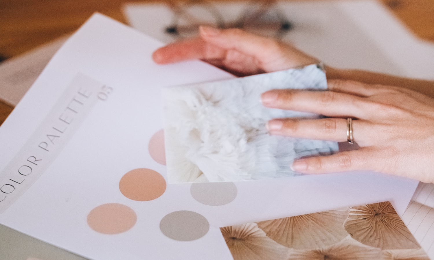
If you came away from 2023 wondering where your dream clients were hiding… this blog post is for you. Today we’re going to cover the
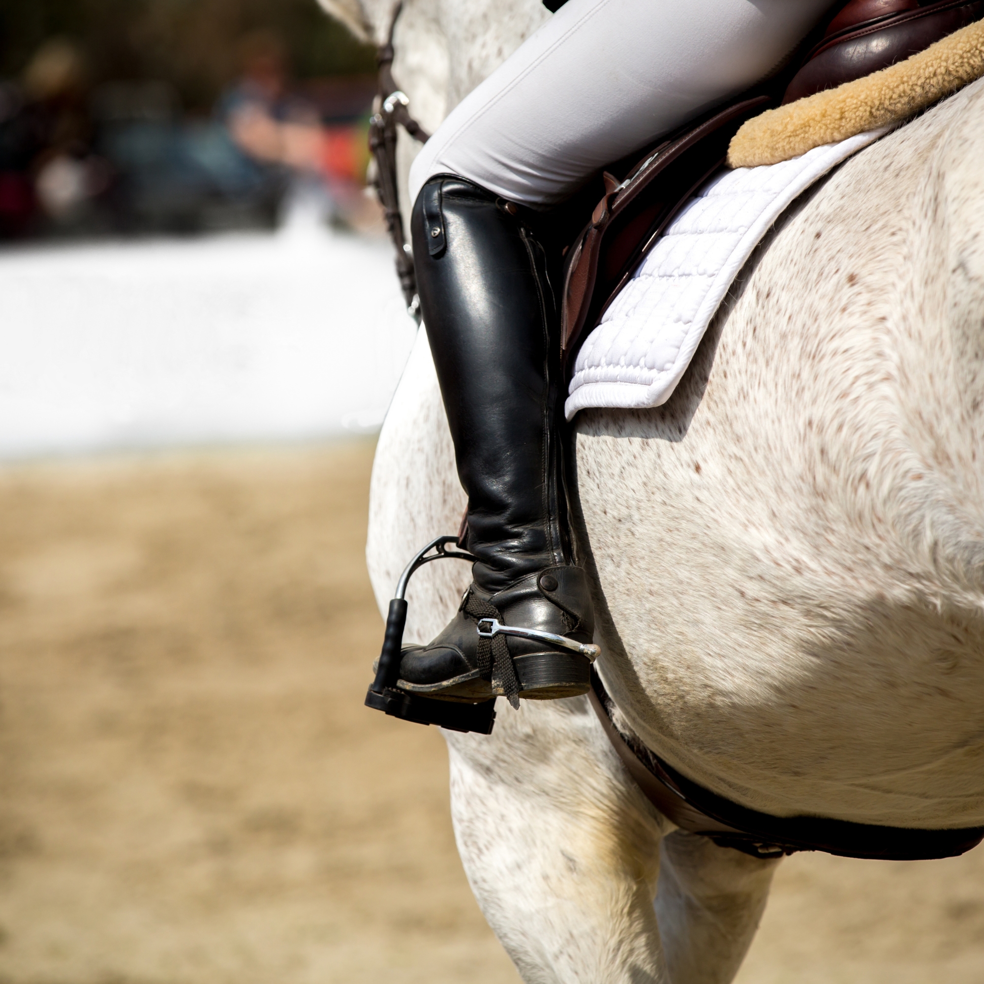
With the holiday season getting closer, it’s time to sleigh your equine business’s holiday content. But amidst the tinsel and joy, don’t let your brand
If you haven’t updated your equestrian website favicon, you’re missing out on an opportunity to enhance your brand’s credibility. But first, let’s address the question: